Space-saving Threaded Comment Design Concept
I think that choosing threaded comments for a social-like page is a good practice. If you choose Drupal’s built-in Comment module for providing the opportunity to comment on your articles, you can configure it to use threads. However, displaying threads at smaller window sizes, such as mobile phones, can be difficult. This article is about how to display threads in a compact, space-saving way.
Previously I have defined the margin of the indentation not with absolute (px and even em or rem in this context), but with a parent-relative unit: for example with margin-left: 10%;. I was happy with this for years, and I still think that this is a good-enough solution. But after a little research I’ve found an even better way (that can be used on the top of the previous approach).
A smarter solution
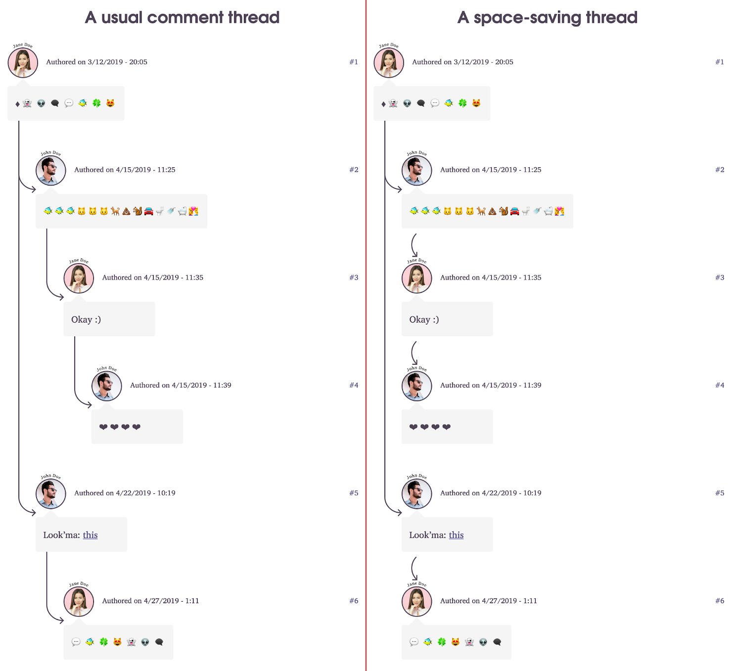
The concept is relatively difficult to explain with words (I won’t even try), but it is easy to demonstrate visually. There it is:

The essence is, instead of displaying the indentation unconditionally, we only make it visible if it is followed by a comment that belongs to a higher thread than the indentation of the comment it follows.
Sources:
- How to display threaded discussions on the web by Rian van der Merwe
- KajMagnus’ answer to the topic “What is a good way to display infinite nested comments?”